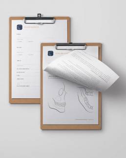
The main emphasis is on comfort and well-being combined with state of the art technology and dental practices.
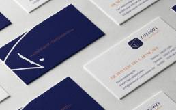
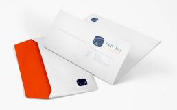
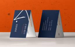
The whole corporate design reflects these two pillars. The simple and modern font projects the competence without frills. The icon in contrast brings in a personal and intimate reference, as the letter ”T” is the genuine handwriting of the dentist himself.
ClientDentist Dr. HennessenServicesCorporate Design | Branding | Webdesign | PrintYear2019Linkwww.zahnarzt-hennessen.de